SPDR Regional Banking ETF (KRE)
Key Statistics – KRE ETF
Thank you for reading this post, don't forget to subscribe!
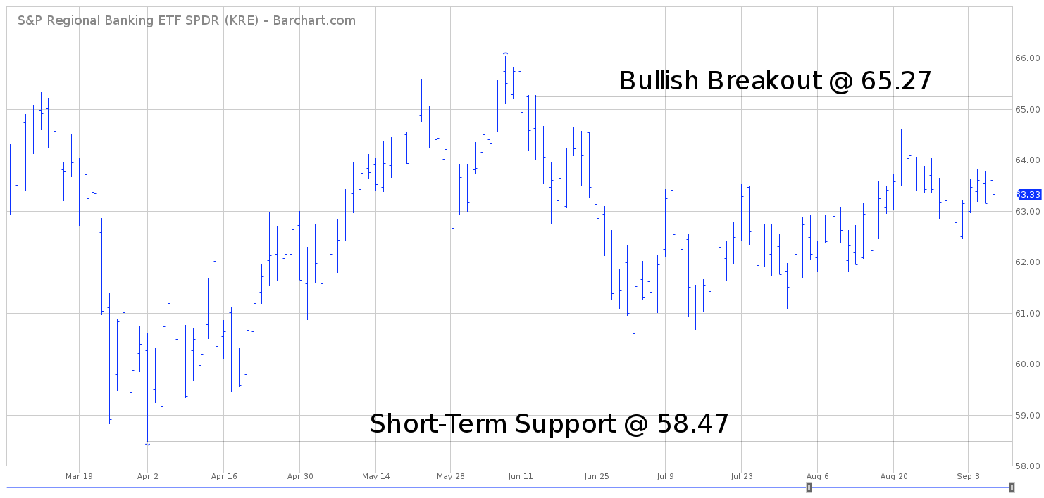
Minor Support Level 58.47 Minor Resistance Level 65.27
Major Support Level 17.24 Major Resistance Level 66.04
Minor Buy Signal 66.04 Minor Sell Signal 57.28
Major Buy Signal 72.67 Major Sell Signal 14.42
BRIEF OVERVIEW – KRE ETF
During the past 12 months, there has been a growing concern among Wall Street economists and major financial institutions that the US economy is on the verge of another financial crisis similar to 2008. The major concern among these economists involves the relaxed lending standards within the banking industry, which was the main cause of the 2008 meltdown. More specifically, they point to the fact that banks have slowly decreased their loan loss reserves during the past two years and that consumers will be unable to repay the debt due to rising interest rates. Are we on the verge of another financial crisis? Have consumers finally hit a brick wall in terms of their ability to repay bank loans? Let’s examine the facts.
Arguably, the best indicator in determining domestic lending standards is to review the health of the regional banks located throughout the United States. Some financial experts will argue that it’s best to analyze the large money center banks as a means to study domestic lending standards. Thirty years ago, that was probably a valid argument. However, these days the money center banks are nothing more than giant hedge funds, generating the majority of their profits through trading and investing. Only a small percentage of their revenue is derived from bank lending. Therefore, the regional banks are a much better indicator than the money center banks.
The SPDR family of exchange traded funds (underwritten by State Street Global Advisors) introduced the Regional Banking ETF on June 19, 2006. The ticker symbol is KRE. The ETF allows investors to gain exposure to a diversified group of regional banks located across the United States. KRE consists of 124 different holdings. The top five holdings include SunTrust Banks Inc, CIT Group Inc, Huntington Bancshares Inc, KeyCorp and Regions Financial Corp.
SHORT-TERM VIEW – KRE ETF
KRE has been locked in a trading range during the past four months. Currently, the ETF is trading near the middle of the range. Therefore, the short-term view is neutral. The important numbers to watch are 58.47 and 65.27. The most likely outcome is an eventual breakout to the upside @ 65.27.
LONG-TERM VIEW – KRE ETF
In the Fall of 2008, the global financial system was on the verge of collapse. To this day, most American citizens have no idea how perilously close we came to a complete financial meltdown. Only a small group of financial leaders from Wall Street’s inner circle were actually aware of the magnitude of the situation.
Many financial historians will argue that the Federal Reserve Board was responsible for creating the financial crisis by relaxing bank lending standards and maintaining a loose monetary policy. Most likely, the Fed was partially responsible for the financial meltdown. However, several other governmental agencies and political leaders also deserved part of the blame. At the end of the day, there was plenty of blame to go around for everyone.
During the 2008 crisis, Ben Bernanke was the chairman of the Federal Reserve Board. Without question, Bernanke took most of the “heat” for the economic collapse. He couldn’t escape the barrage of criticism that was levied at the Fed. In addition to dealing with all of the negative criticism, Bernanke was responsible for devising a plan to restore economic confidence and repair the damage caused by the crisis.
Whether you like Bernanke or despise him, most financial historians agree that Bernanke did an excellent job of minimizing the damage caused by the 2008 crisis. With help from the US Treasury Department, Bernanke and his team created several “alphabet soup” economic programs which prevented the domestic economy from falling into a multi-year depression. Less than one year after the beginning of the financial crisis, the US economy was slowly beginning to recover. Although economic growth has been rather slow during the past decade, it certainly could have been much worse.
Many historians believe the global economy is on the verge of another collapse. Is this true? Are we about to experience another meltdown? If the financial markets are in the early stages of another crisis, the best place to look for warning signs is in the US banking system. During the 2008 crisis, the banks were the first sector to show signs of trouble. Are cracks beginning to appear in the US banking system in 2018? Let’s examine the facts. Please review the following table.
Loan Loss Reserves to Total Loans
US Banks With Assets Under $1 Billion
Date Number Date Number Date Number Date Number
Q1-05 1.32 Q2-05 1.31 Q3-05 1.30 Q4-05 1.29
Q1-06 1.29 Q2-06 1.26 Q3-06 1.26 Q4-06 1.25
Q1-07 1.26 Q2-07 1.25 Q3-07 1.25 Q4-07 1.27
Q1-08 1.38 Q2-08 1.35 Q3-08 1.38 Q4-08 1.51
Q1-09 1.57 Q2-09 1.66 Q3-09 1.76 Q4-09 1.87
Q1-10 1.91 Q2-10 1.92 Q3-10 1.94 Q4-10 1.98
Q1-11 2.05 Q2-11 2.02 Q3-11 1.99 Q4-11 1.95
Q1-12 1.96 Q2-12 1.92 Q3-12 1.88 Q4-12 1.81
Q1-13 1.84 Q2-13 1.77 Q3-13 1.73 Q4-14 1.65
Q1-14 1.66 Q2-14 1.60 Q3-14 1.56 Q4-14 1.50
Q1-15 1.49 Q2-15 1.46 Q3-15 1.44 Q4-15 1.40
Q1-16 1.41 Q2-16 1.39 Q3-16 1.37 Q4-16 1.35
Q1-17 1.36 Q2-17 1.36 Q3-17 1.33 Q4-17 1.30
Q1-18 1.32 Q2-18 1.31
Source Federal Reserve Bank of St Louis
This table displays loan loss reserves in comparison to total loans. As you can see, the number dropped to a very unhealthy level of 1.25 in the third quarter of 2007 (highlighted in red). In other words, the total amount of funds reserved for loan losses was only 1.25% of total loans. Of course, this turned out to be an early warning sign of trouble ahead. Within 12 months, the entire banking system was on the verge of collapse.
As a side note, please notice how quickly loan loss reserves recovered as soon as the financial crisis was underway. Immediately following the beginning of the crisis in Q3 2008, banks quit lending and regulators tightened the screws on all lenders (thanks to the Dodd-Frank legislation). By Q1 2011, loan loss reserves had risen to 2.05 (highlighted in green). It certainly didn’t take long for the banks to return to conservative lending standards.
Today, we find ourselves in a very similar situation. Loan loss reserves are at historically low levels. For Q2 2018, the level is dangerously low @ 1.31. Is this a ominous sign of trouble just around the corner? Maybe. However, loan loss reserves could remain at low levels for several years before a crisis develops.
Another important statistic is the level of bank capital in comparison to total assets. In 2007, banks were operating with an extremely low level of capital. In fact, the low level of capital was more of a concern than the anemic level of loan loss reserves. What is the level of bank capital in 2018? Please review the following table.
Bank Capital Ratios
2007 Versus 2018
Bank 2007 Ratio 2018 Ratio % Difference
Citigroup 2.9 8.6 196.5%
Bank of America 3.6 7.9 119.4%
JP Morgan Chase 4.9 7.3 48.9%
Wells Fargo 6.0 8.0 33.3%
Source KBW Research
As you can see, bank capital ratios among the four largest banks in the United States are dramatically better today versus 2007. The comparison is not even close. This table is an excellent indication that banks are in much better financial shape today compared to 2007.
By the way, the capital ratios for the regional banks are just as strong as the large money center banks. In terms of capital ratios, all US banks are very healthy.
If the banks are so healthy, why are loan loss reserves hovering at such low levels? Because, for the first time in several years, banks are finally beginning to originate more loans. This is a sign of an improving domestic economy. As long as capital ratios remain strong, there is absolutely no reason to be concerned about the low level of loan loss reserves. For now, the US banking system is in good shape. This includes community banks, regional banks and money center banks.
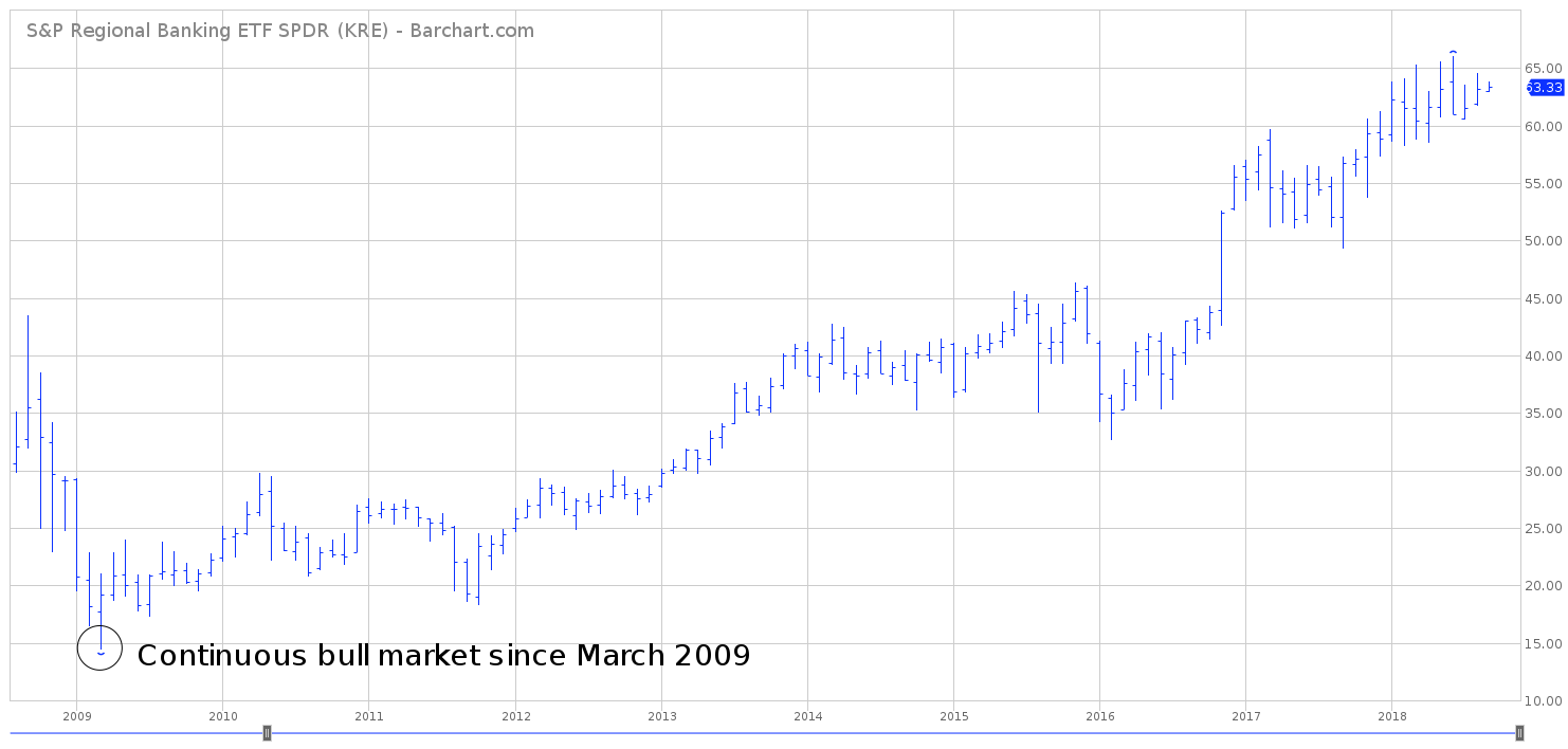
In regard to KRE, the long-term view is bullish. Essentially, KRE has been grinding its way higher since establishing an important low in March 2009. There’s no indication that the bull market is on the verge of rolling over to the downside. It would take a weekly close below 17.24 to reverse the long-term bullish momentum.
SHORT-TERM CHART – KRE ETF
Please review the 6-month chart of KRE. The short-term chart pattern is neutral. A weekly close above 65.27 will turn the trend in favor of the bulls. Conversely, the bears will gain the upper hand on a weekly close below 58.47. Most likely, the short-term trend will turn bullish.

LONG-TERM CHART – KRE ETF
Please review the 10-year chart of KRE. The ETF has enjoyed a bullish trend since March 2009. All technical indicators are projecting a continuation of higher prices. Based on Fibonacci calculations, the next important level (beyond the old high @ 66.04) is 72.67. At least for now, there’s no reason to expect a substantial decline.