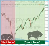
One of the elements I enjoy tracking is the number of Exchange Traded Funds that currently have a Positive Power Score. In particular, when compared to the entire list.
Thank you for reading this post, don't forget to subscribe!It tells you a lot about the strength – or weakness – of the broader markets. Since our ETFs cover all market caps, all major regions, all asset classes and many sectors you get a very broad range view of the health of the global markets.
It would not be a stretch to say that if 10% of the ETFs have a positive Power Score things are quite dire. If 80% are positive – then clearly most markets are rolling in the upside momentum gains.
I thought it would be a productive idea to start to quantify the percentages. Let’s take a look from the start of 2015 until the present here:
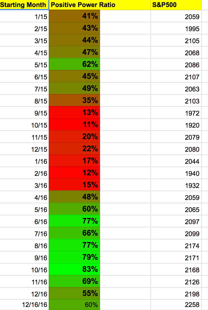
Let’s discuss what you are looking at above. The column with the months shows the current percentage of ETFs we are tracking (150+) at the start of the month that is exhibiting a positive Power Score. Almost always, those are ETFs that are making gains and in an uptrend. You can then see the percentage from none to 100% that are positive at the start of that month.
Lastly, it’s interesting to see where the S&P500 was at the start of that month since you can start to draw some fairly conclusive correlations between the Power Score and the S&P500 (along with other major benchmarks.)
The question is whether this can be predictive? Based on my observation I typically see anything 50% or higher being firmly in buy territory. 40% – 50% is a yellow light for me. There are issues, and we should be watching for a potential correction (assuming it’s on the way down from a higher threshold) and definitely below 40% would indicate losses were happening in your portfolio typically.
I’ve then color ranked from the most solid green being the best months, to the reddest being the weakest. The peak was October 2016. The weakest in this range was exactly one year prior in October 2015.
You can see the predictive nature since it dropped below 40% at the start of August 2015. The start of April 2016 was the first time back above 40 and May 2016 above 50. You can see being sidelined during that full stretch certainly avoided a pretty good sized drawdown.
I’ll update these numbers weekly for you – as well as save it on a monthly basis so we can get some early indicators on a macro level when to expect the next downturn.
Any comments and questions? Feel free to leave those below.